Translate

Sunday, September 4, 2016

ColourQ#357


LOVE the color combo from ColourQ Challenge #357. When I saw Tracey's card, I knew I wanted to use my Friendly Flowers stamps, but I couldn't use my Stampin' Up Ink Pads to stamp them because they are outline stamps....and so began my big mess of trying to create those brightly colored flowers. My first mistake was to stamp the flower BEFORE applying the colorful ink with a dauber. Then I tried to add white accents with an old gel pen...very frustrating as it took a long time to cover the Melon Mambo. Then I used a black gel pen to go over the lines and I smudged it so badly I had to re-do a Pumpkin Pie flower. But I learned a lesson here so that last flower (the one on the bottom left) was stamped AFTER I applied the ink to the paper. Perfect!! 


For the rest of my card, I had in mind to put a black sequin swirl behind the flowers, but I should've checked my inventory first because I didn't have one. Instead, I used the multi-line circles from Party Patterns which coordinated nicely with the dot border stamp. I die cut the sentiment out of Pumpkin Pie card stock and added a shadow of Black behind it. I finished my card with a few black pearls I found while searching for the non-existent swirl. The end result is a rather clean & simple look, but it sure took a lot of effort to get there. I did learn a few lessons though, so it's all good! Now I just need to get some new gel pens and I will be all set. TFL!


I'm entering this in ColourQ Challenge #357:


and Freshly Made Sketch #252:


Supplies Used:
Dies: Spellbinders: Sentiments One
Stamps: Fiskars: Friendly Flowers, The Paper Company: Dots & Stripes, My Favorite Things: Party Patterns
Ink: Stampin' Up: Melon Mambo & Pumpkin Pie, Memento: Tuxedo Black
Paper: Ranger: Specialty Stamping Paper, Stampin' Up: Melon Mambo & Pumpking Pie

Friday, August 26, 2016

MOJO 462 #2

Here is the second Sympathy Card I made for Mojo Monday #462. This time I rotated both of the scalloped squares, added a white border and used a white swirl. The other card follows the sketch more closely, but I like this one a little better - I think the white makes it look a little brighter. TFL!
SUPPLIES USED:
Paper: Our Daily Bread Designs: Christian Faith
Dies: Our Daily Bread Designs: Ornamental Crosses, Sizzix: Swirls, Nestabilities: Scalloped Squares, EK Border Punch: Open Scallop

MOJO 462 #1

Sadly, I was in need of several Sympathy Cards. I always have such a hard time writing these cards out, so I prefer to stamp the sentiment inside while leaving the front free of words. I followed the sketch for Mojo Monday #462 using papers from Our Daily Bread Designs. Once I chose all the papers, I decided to rotate the inner square to frame the cross better. I struggled with what to use for a circle embellishment - buttons and bows didn't seem to belong on this sympathy card, I decided on using the swirl, but in retrospect I wish I would have die cut it in white so it would show up better. Thanks for stopping by! 

SUPPLIES USED:
Paper: Our Daily Bread Designs: Christian Faith
Dies: Our Daily Bread Designs: Ornamental Crosses, Sizzix: Swirls, Nestabilities: Scalloped Squares

Sunday, August 21, 2016

CAS(E) this Sketch #185


This is the second card I am entering in ColourQ Challenge #354 (I hope multiple entries are allowed!). I have a feeling I am going to use this combo again & again because it is so striking! Again, I used a pretty blue rose but this time I used Sizzix Swirls instead of the MFT Medium Flourish. I think swirls/flourishes are so versatile, I imagine one can never have enough of these in one's stash! I added some black hearts under this sentiment and also used the more detailed leaf stamps from Altenew. The Vinatage Roses Stamps/Dies are one of my all-time favorites. It takes a little practice to get the layers lined up, but once they are just right, the MISTI makes creating multiple images incredibly easy. That tool is worth every penny! I'm also entering this card in the CAS(E) this Sketch #185 Challenge. TFL!


I was inspired by this awesome card by Wanda Cullen (sorry for not referencing this sooner):


Supplies Used:
Stamps: SSS: Happy (sentiment) and Sending & Wishing (hearts), Altenew: Vintage Roses
Ink: Distress: Black Soot, Memento: Tuxedo Black, London Fog and Bahama Blue, Stampabilities: Baby Blue, Colorbox: Cyan
Dies: Altenew: Vintage Roses, Sizzix Swirls
Other: SSS Diagonal Stripe Stencil, The Paper Studio scalloped scissors

Monday, August 15, 2016

Fab Friday 93


Oh how I just LOVE the color combo of ColourQ Challenge #354! This is the first of two cards I am entering in that challenge today. Wanted to use the gorgeous Vintage Roses Stamps & Dies and was very happy with how the cool blue rose turned out. When I saw the color challenge, I immediately decided to use my new diagonal stripe stencil in black. I cut a small scallop border on the blue paper before adhering my striped strip. The sentiment was stamped onto a piece of white cardstock I had die cut using the matting basics dies to which I added a black outline border with a marker. I stamped some plain, simple leaves in grey and tucked them under the rose and added a small scalloped strip of blue under the sentiment box. I'm also entering this card in the Fab Friday 93 Sketch Challenge. TFL!


I was inspired by this awesome card by Jen (sorry for not referencing sooner): 
Supplies Used:
Stamps: SSS: Happy (sentiment), Altenew: Vintage Roses
Ink: Distress: Black Soot, Memento: Tuxedo Black, London Fog and Bahama Blue, Stampabilities: Baby Blue, Colorbox: Cyan
Dies: MFT: Medium Fancy Flourish, Spellbinders: Card Creator A2 Matting Basics B, Altenew: Vintage Roses, Sizzix Swirls (leaves)
Other: SSS Diagonal Stripe Stencil, The Paper Studio scalloped scissors

Monday, July 25, 2016

Party Patterns in Gold


I was inspired by this awesome card by Deb Valder:
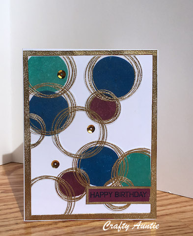
Although I don't have that same background stamp, I do have My Favorite Things Party Patterns which has similar images. I figured I could recreate this card no problem, I'd just have to stamp the circles separately. How hard could it be? Well, first off, I only had two different sizes of the outline circles, which made me have to really think about placement of all the circles since the above card had several different sized circles. Also, I wanted to enter ColourQ Challenge #351, so I decided to make my circles gold. Then I got fancy and decided to emboss them in gold. Well, I did use an embossing buddy before I embossed, but the pretty gold ep left a shimmery film EVERYWHERE on my card. Not the look I was going for, but the card was still usable, so I continued on by adding my bold SU inks for the inside of the circles. I have such a love-hate relationship with these ink pads! I LOVE the coverage you get and all the pretty colors, but I just can't seem to use them without making a big inky mess of things. I'm getting the hang of tapping lightly, but I need to be more careful and not get my fingers all inky because I end up ruining my cards. After all my planning and embossing and stamping, my card was filled with inky splotches. UGH! Rather than start over, I decided to cut out all the white (and white-with-ink-splotches) out and paste this fussy-cut image onto a card base that I adhered a gold frame to. But when I went to put my sentiment in the perfect spot, I realized I had pasted my image on UPSIDE DOWN. UGH!! Now I had to cut the card front off and paste it onto another card. It's a little thick, but now I was able to put the sentiment right where I wanted it, so I am quite happy with the result. But holy moly did it take me a long time to finish this!! I will try this background again - I am sure it will be much quicker if I don't emboss and also if I remember to be more careful when stamping! Thanks for stopping by!


Ink Splotches
Fussy-cut pieces

Second Card
Supplies Used:
Stamps: My Favorite Things: Party Patterns, Close To My Heart: Celebration (sentiment)
Inks: Stampin' Up: Pacific Point, Bermuda Bay & Rich Razzleberry; VersaMark w/gold ep

Thursday, July 21, 2016

Horse Love


Adding these cards to the Mix It Up Challenge #8 at Sugar Peas Designs. Their sketch was a good starting point for me as I knew I wanted to use these horse stickers (since my girls are at Horse Camp this week), but I just needed a sketch idea to get a design going. I've been trying to figure out how to add a little something to get that 'complete' look to my rather simple cards, and for these cards, distress inks seemed to do the trick. They make all the elements pop - a big difference in real life I took a photo of a before shot to help illustrate what a little distress ink can do. I just love my distress inks (perhaps that is why I own so many!!). TFL!

Before & After Inking:


Supplies Used:
Dies/Punches: Sizzix Heart #2, Simon Says Stamp Mini Hearts Set, Fiskars Bubbles Border Punch, EK Flourish Scroll Border Punch
Inks: Distress: Mermaid Lagoon, Walnut Stain & Wild Honey
Darice Wood Grain EF
Paper: We R Memory Keepers: Happy Campers
Other: the Paper Studio Puffy Horse Stickers, Darice Twine

Monday, July 18, 2016

Sending Smiles MFTWSC289


Made this for My Favorite Things Wednesday Sketch Challenge #289 which uses this sketch:

I used brown fun foam to pop up the sentiment which not only gives it dimension but adds a shadow effect as well.  I will be sending it to my older daughter who is at another week of camp. I love this paper pad, I have to try not to make ALL their camp cards with it! TFL!

Supplies Used:
Stamps: MFT Party Patterns, Simon Says Stamp: Sending & Wishing
Ink: Distress Inks: Mermaid Lagoon, Peeled Pain, Tea Dye, Versafine Vintage Sepia, Wink of Stella
Paper: We R Memory Keepers: Happy Camper
Dies: Simon Says Stamp: Sending

Saturday, July 16, 2016

Love Flower Power

Another week of camp, another crazy frenzy to create and get into the mail before the mailman comes. Hope I made it! Entering this card in Sketch Challenge 245 over at Freshly Made Sketches. Love their challenges! TFL!

Supplies Used:
Paper: Ki Color Crush
Stamps: Fiskars Friendly Flowers
Dies: Simon Says Stamp mini hearts, Nestabilities Labels Eleven, EK Open Scallop Punch
Ink: Memento Tuxedo Black

Tuesday, July 5, 2016

Don't Flip Out Card

Hoping to bring some reassurance to my youngest camper. Soon after we dropped her and her sister off at camp, a tornado watch was issued for the area. Luckily the storms passed without a tornado developing, but more storms are in the forecast. Maybe I should send this card to myself to remind ME not to flip out!! I'm entering this card in the Cas(e) this sketch #179 Challenge. TFL!


Supplies Used:
Paper: doodlebug design: take note
Stamps: TSOL flipflops2stamp
Ink: SU Tempting Turquoise
Dies: Spellbinders scalloped circles
Other: Sequins

Enjoy Camp Card

Well it's that time again - time to make thinking-of-you-while-you-are-at-camp cards which need to be sent asap so that they arrive before the camper returns home.  I picked up this delightful paper pad on clearance; should have purchased two. I just love the bright color combos. Hope they send some cheer my girl's way as the weather looks pretty rainy the whole week at Camp O. I entered this in the MOJO 455 Challenge. TFL!
Supplies Used:
Paper: doodlebug design: take note
Stamps: TSOL flipflops2stamp
Ink: SU Pacific Point & Tempting Turquoise
Dies: Spellbinders scalloped circles
Other: Heart punches, Stickopotamus Mini Brush Letters Stickers


Saturday, June 18, 2016

Father's Day Card

Inside:


Still trying to get back in the swing of things after having been away on vacation, so I guess I have a good excuse for waiting until the last minute to make my father-in-law a card for tomorrow. Hoping I will still be able to manage to make one for my dear hubby, too, but I'm sure I won't get around to posting that one by tomorrow! 

I made this one for Sketch Challenge SC597 over at Splitcoast. Thanks for the inspiration, it helped a lot! Masculine cards are the hardest for me, and while I just bought a new Baseball Stamp Set, my father-in-law and hubby are not sports-minded guys. I have a ton of Camping dp, but I've made them so many camping-themed cards I had to try for something different. Luckily I had this stamp set from TSOL which has both great images and sentiments. Whew! 
TFL!


Supplies Used:
Paper: teresa collins Everyday Moments
Stamps: TSOL hot4balloons
Ink: Memento Paris Dusk, TH Distress in Broken China & Faded Jeans, VersaMark
Other: clear EP
Dies: Nestabilities Scalloped Circles & Classic Circles, Card Creator Sets A & B

Sunday, June 5, 2016

CAS Celebrating 21

Tried to make a quick card, but an hour or so later, I still hadn't finished. I did make several panels for future cards, though, so THOSE will be quick & easy (I hope!!).

Now that my nieces are growing up, it's getting difficult to decide what kind of birthday cards to make for them. I figured with geometric shapes and bold colors outlined in black, you can't go wrong. Hope she likes it! 

This is as clean & simple as I can get. It was so difficult not to do anything with all that white space...but I do like the clean look. I added some bling with a blue Wink of Stella pen, which you can see only in the close-up shot. It's not easy to capture that glitter on camera! TFL!

Entering this into the following challenges:
and
CAS on Sunday where the Theme is Sparkle (I hope the Wink of Stella counts)


I CASE'd Wilma's card - love her color combo of Twisted Citron & Mermaid Lagoon.


Supplies Used:
Stamps: My Favorite Things: Party Patterns, Fiskars: Classic Alpha, We R Memory Keepers: Celebrate
Inks: Stampin' Up Tempting Turquosie & Melon Mambo, Memento Tuxedo Black, VersaMark, White EP
Dies: Sizzix Circles 
Other: Blue Wink of Stella Glitter Pen

Saturday, June 4, 2016

Soft Sky Roses


I was so excited to finally get to use the beautiful Vintage Roses Stamp Set from Altenew. The images are so realistic and they are not at all difficult to produce. The most challenging thing for me was trying to decide what color inks work well together and I am happy to say that you don't really need three or four different inks to create these beautiful roses. Stamping off will produce a lighter shade, and double or even triple stamping produces darker shades, and with a MISTI, these techniques are super easy to do. For me, color matching my inks with my paper stash is a bit challenging as I tend to buy different shades of every color imaginable and nothing ever seems to match as well as I like. I am happy with the color scheme I used in this card because the inks & cardstock are both Stampin' Up colors. In the future, I plan on buying inks and cardstock from the same company and now I have a whole new Wish List over at Altenew! Looking forward to making many cards using these Roses in the future. LOVE this set and its coordinating die set!!

Supplies Used:
Paper: Stampin' Up
Stamps: Altenew Vintage Roses, Verve sentiment
Dies: Altenew Vintage Roses
Ink: Stampin' Up Pool Party, Soft Sky, Old Olive and Pear Pizzazz

A second card I made - only slightly different from the one above:


Wednesday, May 18, 2016

Swirly Spring Bday


I made these two cards for the MFTWSC280 Sketch Challenge at MFT (and I even used an MFT Die!) but I missed the deadline for entry! UGH!!! Well, the sketch served me well as I was happy with how these cards turned out. I was so sure I was going to make IDENTICAL cards, but, as always, there are differences: The dark purple panel and the inner squares are not the same size (and the squares are different patterned paper), and the sentiment tags are slightly different. The second card also has a perforated line at the top that I added with my Sew Easy tool. I didn't really like how that turned out so I didn't repeat it on the other card. I originally cut out the flowers without stamping them, then decided they needed more pop, so I did something unconventional by carefully placing my die cut on top of the stamp that I had inked with VersaMark. Not an ideal way to emboss, but I got lucky in that it worked just fine. Thanks so much for looking!

Supplies Used:
Paper: SEI Couture
Stamps: Heartfelt Creations Botanical Floral, TSOL happyBday2you (sentiment)
Dies: My Favorite Things Medium Fancy Flourish, Spellbinders Rose Creations, Classic Edges One
Ink: VersaMark
EP: Zing EP in Powder and WOW! EP in Shrinking Violet

Tuesday, May 17, 2016

May Mojo

Was so excited to spend a day making cards - so fun...and quite necessary. May is a heavy-duty card month, with several birthdays as well as a First Communion and a whopping FIVE family graduations this year. Here are a the first of what I hope to be several May postings:

First up are two cards I made using pre-made pastel-colored card bases. (Hot Buy at Michael's that I couldn't pass up). I followed the latest Mojo Monday Sketch (448)

and pulled out my favorite Spring paper (SEI Couture). 


Supplies Used:
Stamps: Stampin' Up Tag Talk
Dies: Stampin' Up Beautiful Wings Embosslits, Simon Says Stamp Leanna & Chrissy Butterfles, Nestabilities Circles & Labels One
Inks: Colorbox Cat's Eye Eggplant

While I was at it, I made a second card following the same Mojo Sketch:


Supplies Used:
Stamps: Simon Says Stamp Hand Lettered Encouragement
Dies: Stampin' Up Beautiful Wings Embosslits, Simon Says Stamp Sending, Nestabilities Circles
Inks: Colorbox Cat's Eye Eggplant

Monday, March 7, 2016

More SU Flower Cards


While making my previous card for the Color Challenge at Splitcoast, I decided to take advantage of not only having all those supplies at the ready, but also having a plan that could easily be used to make several cards I need right now.  I figured I could crank out three more cards quickly....three hours later, I did have my additional cards, but not one is identical to another. I change my mind so often in the design process - I wonder how many other people do this?!

The basis for my cards was going to be the exact same: lattice stencil for background, a few flowers and leaves and maybe a small sentiment. The only thing that was going to be different was the color scheme. Two were for women, two for men, so I could have at least had two sets of identical cards! 

This first one was one of the simplest I've ever made. And I like it. I think I will definitely make more of these:

Maybe next time I will move the sentiment to the bottom right corner and put those candy dots on a vertical in the top right corner. And maybe I will use a fancy edge instead of the strip of solid paper, or maybe ribbon? I will probably pop-up the flower, and maybe even add a few more....in different colors.....oh dear, see where this is going? I can't stop!

My next two cards are really similar. It's the first time I used masking paper and while I love the sharp lines you get, I made the border too wide the first time. So when I expanded the stenciled area, I added more flowers to make the whole design 'bigger'. Then I thought the first card was too plain, so I added a purple colored pencil border around the stenciled area. 
Without Border


So in another attempt at making identical cards, I came away with four very different cards, though they all use similar elements. None of my flowers are identical, none of my background stencils look the same, and even though the only sentiment I used on the card fronts was the word 'hello', one is stamped, the other a die cut.

I did have fun experimenting with the different flower/color combos and coming up with a design or two I think I can repeat in the future.
Thanks for stopping by!

Supplies Used:
Stamps: Stampin' Up Flower Patch, sentiment from Hero Arts Truly Appreciated
Dies: Stampin' Up Flower Fair Framelits
Inks: Stampinp Up: Wild Wasabi, Pacific Point Tangerine Tango, Pool Party and Blushing Bride, Colorbox Heliotrope
Other: Tim Holtz Latticework Stencil

Tuesday Color Challenge

Inspired by last Tuesday's Color Challenge at Split Coast Stampers, I attempted yet again to make several cards at once to be more efficient. The first card I made used the colors for CC572, so I am posting it here. The other three were quite different, so they get their own post. 

I own both the Bright and Subtle Ink Pad Sets, so I was happy that I had all four of the colors for the challenge. I needed a masculine card, so I stamped the flowers using both shades of blue. I stenciled the Lattice Design in Real Red, then mat it with Real Red and Pacific Point. The sentiment was cut from Wild Wasabi then I finished off the card with some sequins and Candy Dots. 

Thanks to everyone over at Splitcoast for all their inspiration!

Supplies Used: 
Stamps: Stampin' Up Flower Patch
Dies: Stampin' Up Flower Fair Framelits, Technique Tuesday Say It - Hello Die
Inks: Stampin' Up: Wild Wasabi, Real Red, Marina Mist and Pacific Point
Paper: Stampin' Up: Wild Wasabi, Real Red and Pacific Point
Other: Tim Holtz Lattice Stencil, Stampin' Up Candy Dots, sequins